
The Geography of Housing Affordability
A national crisis, or a big city crisis?


I am on holiday.
Please enjoy a guest post from Aziz Sunderji who runs the excellent Home Economics. A key sentence is this:
Housing costs are high in places where incomes are high. Because the distribution of incomes is unequal, many households spend a high proportion of their income on housing.
Enjoy.

By Aziz Sunderji
Portuguese Fish
I’ve just returned from Portugal. On the west coast of the country, where we were celebrating a wedding, you can get a spectacular 5-course fish dinner for under $20.
That’s because, in Portugal, productivity—and incomes—are very low. Sure, supply might play a part: fish are abundant off the Portuguese coast. But fish are also abundant off the coast of Monaco, where prices are much higher. Incomes are the dominant factor.
Housing Affordability
This is the lens through which I look at the housing affordability problem in the United States. Housing costs are high in places where incomes are high. Because the distribution of incomes is unequal, many households spend a high proportion of their income on housing.
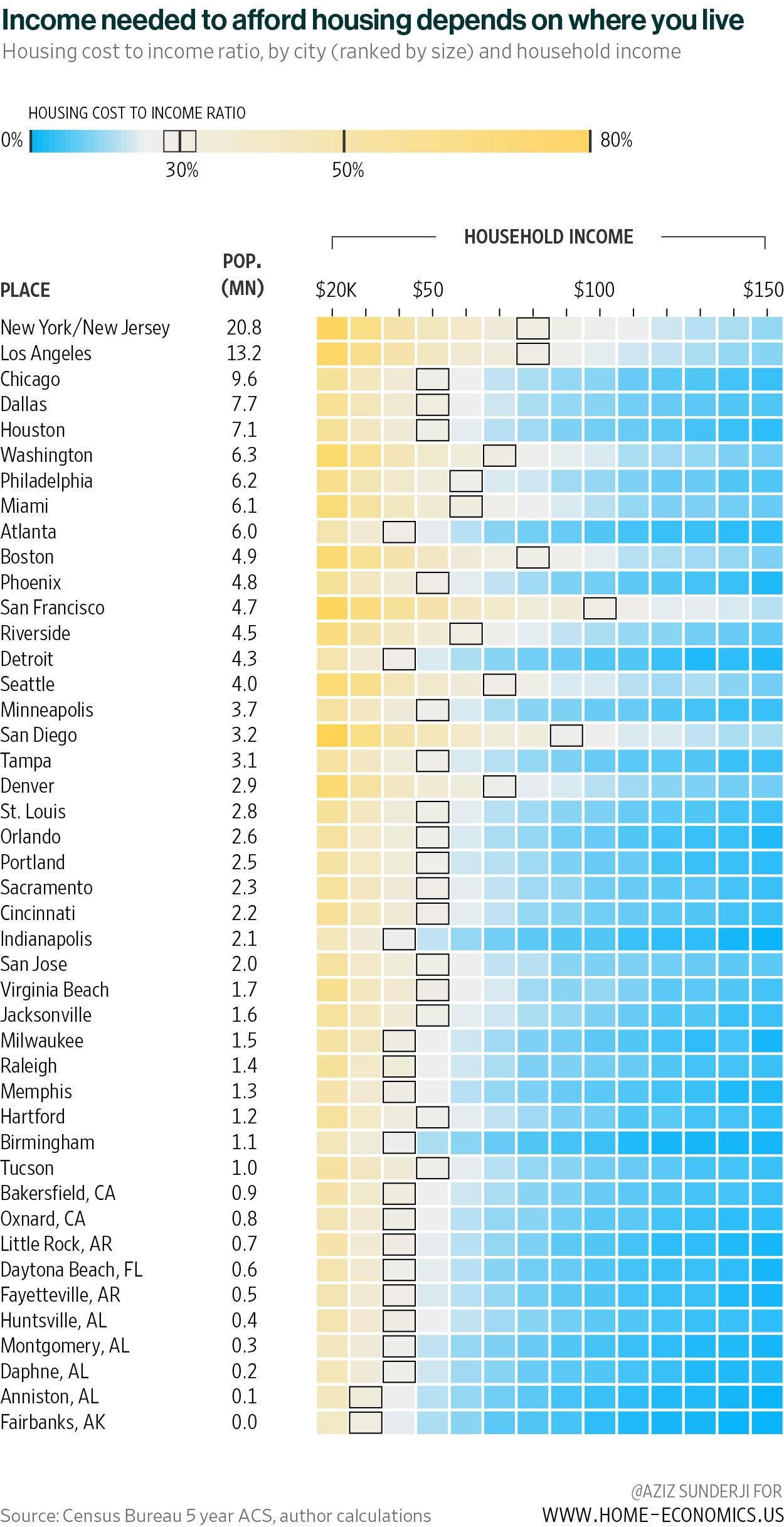
And this is primarily a big-city phenomenon. The chart below shows the proportion of gross income that households (owners and renters) spend on housing, bucketed by income level and by metro area1 size (ranked from largest to smallest).
Conventionally, when households spend 30% of their income on housing, they are said to be “housing burdened”. The income levels corresponding to that threshold in each city are indicated with a black box.
The results of the analysis confirm my priors, but some things stood out:
The income needed to comfortably afford housing mostly breaks down along city size lines. New York/New Jersey and Los Angeles, by far the biggest metro areas, are some of the least affordable. On average, only households in those cities with gross incomes above $80,000 spend less than 30% of it on housing.
But some smaller cities are also expensive. San Francisco is the least affordable metro in the whole country (even households earning $100k are spending 30% on housing). This is a smaller city but with outsized productivity (and incomes). I think the same logic applies to Seattle and Boston.
In other cities—like San Diego and Denver—I doubt it’s high productivity as much as a wonderful climate and other amenities that lead to high housing costs. These are unsurprisingly retiree hotspots. High prices there are justified by high incomes/wealth, even if they are not particularly productive cities.
By contrast, Chicago, Dallas, and Houston are unusually affordable, given their large size.
Labels are shortened versions of the full metro area name. Eg, Los Angeles represents “Los Angeles-Long Beach-Anaheim, CA”. For metro areas smaller than 2.9 million, the names displayed are one of many metros that fall into that population size bucket (rounded to the nearest 100k). For example, the row corresponding to 2.8 million is labelled St. Louis, but it could as easily have been labeled Baltimore.
 | A guest post by
|
I’m guessing the boxes in that graph designate the mean income for a city?
I'm guessing Nashville would look like Denver on this chart?