More eyes on Auckland's upzoning experiment
Unpacking the famous Auckland story by looking at the size of its new dwellings
I have been cautious about some of the evidence being relied upon to declare Auckland’s upzoning for cheap homes experiment a success. My co-author Tim Helm and I have noted concerns previously (see here and here).
Today, guest writer Igor Dupor takes a closer look at the data on the size of new dwellings in New Zealand.
(A draft of this article was emailed in error a few weeks ago. My apologies for the double email. Please enjoy it now and share it widely.)
Many people contributing to the debate surrounding the impact of Auckland's Unitary Plan (AUP) in November 2016 are well-intentioned and intelligent, yet still disagree.
There are many fascinating arguments and findings out there, worthy of further attention.
I'm inclined to lean towards more upzoning for its purported benefits, given I would prefer too many houses over too few. However, the claim that upzoning facilitated additional dwellings that have driven down rents across Auckland sounds impressive but is probably overstated.
TL;DR, here’s why.
Adjusting for composition by looking at square meters consented explains away some of the purported upside.
Momentum in Auckland’s share of consents pre- and post-2016 is somewhat inconsistent with the narrative of the AUP’s impact.
The relationship between consents and relative rent prices is inconsistent over time.
The ratio of housing costs to household disposable income is unperturbed by fluctuations in consents or rents.
Composition adjustment
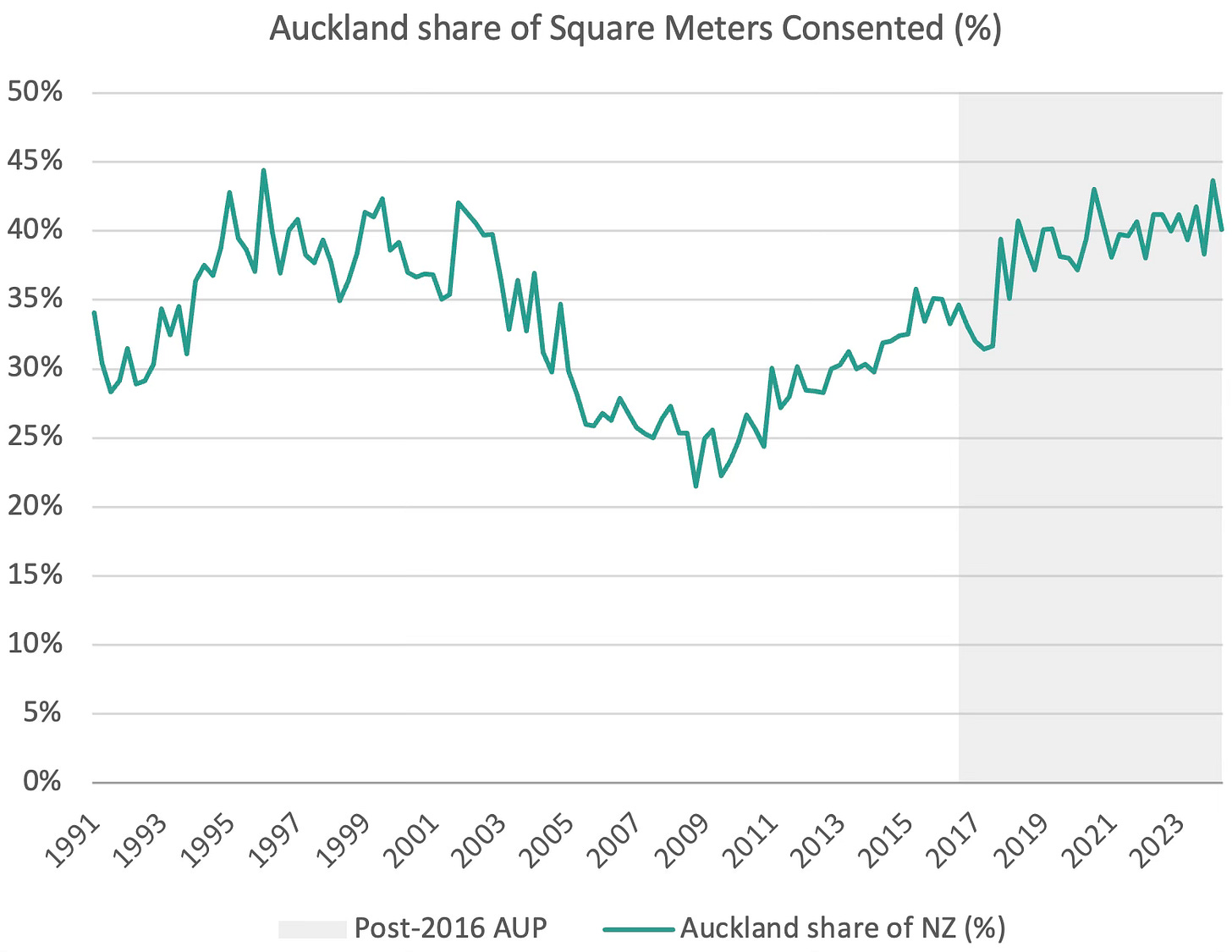
Firstly, I want to refocus the debate on looking at the total square meters of dwellings consented (as shown in Chart 1) rather than the total number of consents. This helps account for the significant changes in dwelling compositions and size since 2016, with the average size of Auckland consent applications decreasing by almost one-quarter since then. Consents for studio apartments are not the same as family-sized homes and this clear oversight requires revisions of studies conducted to date.
Momentum
While Auckland did experience a surge in square meters consented post-AUP, several factors cast doubt on attributing this to the AUP alone. Notably, the momentum in development activities predating 2016 suggests underlying drivers beyond the AUP's influence. Between March 2009 (during the depths of the Global Financial Crisis) and the implementation of the AUP in the December quarter of 2016, Auckland's dwelling consents grew at almost twice the rate of the rest of New Zealand. This surge in Auckland consents occurred without the help of upzoning.
Momentum in Auckland’s share of square meters consented continued after the AUP, showing that Auckland’s activity increased ahead of the rest of New Zealand (Chart 2).
However, three observations make me doubt that causality is driven by the AUP:
The momentum in activity prior between 2009 and 2016 suggests Auckland was already ripe for increased development, for reasons other than the AUP.
Auckland’s share of consents did not begin to increase for a full year after the AUP implementation. If the AUP did drive behavioural changes, one would expect to see a bow wave of consents – a dip in activity prior to November 2016 as prospective applicants await more favourable terms, followed by the pent-up surge in consents immediately afterwards.
The increase in consents in late 2017 was not driven by a surge in Auckland activity, but rather a decrease in other areas, particularly Christchurch and Selwyn districts.
These three observations are not enough to write off the argument that the AUP had a significant impact. Perhaps, Auckland too would have suffered a decline in dwelling consents in late 2017 had it not been for the AUP?
In per capita terms (Chart 3), we still see that between March 2009 and the AUP implementation per capita square meters consented increased by 177% in Auckland but only by 93% elsewhere. Again, Auckland was already recovering well ahead of the rest of NZ for years prior to the AUP.
One may reasonably argue that per capita measures should also consider the flow of new people into Auckland, in addition to the existing population stock. Chart 4 shows the consented square meters per additional person (i.e. square meters consented over the past 12 months versus the change in population over the same period). Strikingly, consents in the Rest of NZ outstripped Auckland for over 20 years, and by significant margins up until about 2014. Only since 2018 has Auckland consented more than the rest of NZ per additional person.
Inconsistency between consents and rents
If the Econ101 narrative were to prevail, this surge in supply in the Rest of NZ should see relatively weaker price changes in the Rest of NZ compared to Auckland, right?
Focusing on the period between June 1997 and June 2014, where consents in the Rest of NZ far outstripped those in Auckland, rents across the Rest of NZ increased by 84.7% but only 64.5% in Auckland.1 Explanations aplenty, but changes in the number of people per dwelling have soaked up much of this ‘excess’ supply. Over the period, Auckland houses have become more densely packed, and less so elsewhere.
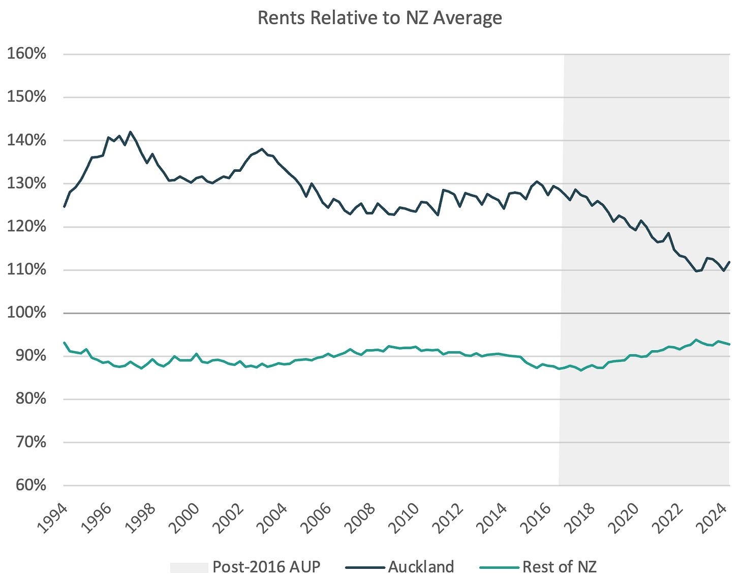
Looking more closely at rents, Chart 5 shows a clear correlation between the implementation of the AUP and declining Auckland rents from late-2017 onwards. Over this period, the correlation between Auckland’s rents and its share of consents is -0.63. The rising tide of consents seems to have placed downward pressure on rents.
If correlation truly equalled causation, then we would expect to have seen Auckland’s deep trough of consents during the early 2010s place upward pressure on rents. This did not happen—Auckland’s relative rents remained broadly stable relative to the rest of NZ. In fact, the correlation between Auckland’s relative rents and its share of consents in the years prior to the AUP was 0.73, implying that the decline in its share of consents placed downward pressure on rents.
Similarly, rents outside of Auckland have remained broadly stable at around 90% of the national average for decades, despite the surges and contractions in its share of consents.
Stats NZ also publish a compositionally adjusted monthly index on rent prices, showing that cities will converge and diverge from national benchmarks over time, but never for longer that 5-10 years at a time (see Chart 6). Perhaps the relatively high rents of the mid-2010s saw Aucklanders move to Wellington and Christchurch in search of bang-for-buck.
Stable housing costs to income
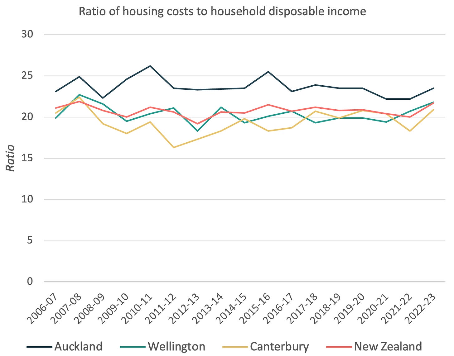
Chart 7 shows the ratio of housing costs to household disposable income. These have remained broadly stable over the past few decades, including in Auckland. Perhaps the decline in Auckland’s rents relative to the rest of New Zealand was not driven by extra consent activity, but rather a decline in disposable incomes relative to the rest of NZ.
It may be the case that the AUP is responsible for some improvement in rental affordability, and has provided tenants better quality housing for the same dollar. It has definitely changed the composition and location of construction, presumably more in line with people’s actual preferences. For me, the AUP has improved the functioning of Auckland’s housing systems but it is not the panacea to the housing crisis. If only it were that simple.
The views expressed in this blog post are my own and do not represent the opinions of my new employer the Ministry of Housing and Urban Development. Any statements made here are for informational purposes only.
This is for the geometric mean from MBIE’s bond statistics.


Nice analysis.
Charts 6 and 7 really speak of convergence. No place remains cheaper long-term. Short-run movements like Auckland 2010-2016 or Wellington 2017-2023 or Canterbury 2021-2024 need to be interpreted in that context. There is often a local policy story, but that local story can't override the forces of spatial equilibrium.
My only data quibble is with Chart 5. Geometric means are subject to the same compositional bias as medians. That decline in the Auckland rent premium over the NZ average will be in part due to more smaller, lower quality dwellings entering the rental stock.