
Lower bound problem of hedonic price indexes
Sometimes you just can't buy the same stuff you used to

Thank you for subscribing to Australia's newest think-tank, Fresh Economic Thinking. Some updates:
My new book The Great Housing Hijack is now available for pre-order. If you want to understand the economics of housing markets and why everyone claims to want affordable housing, but no one wants cheap housing, this book is for you.

On Monday 12th February (7pm) I will be speaking at UBC in Vancouver, Canada, on the topic "Is local democracy the cause of high housing prices?". Tickets here.
Did you miss last week’s subscriber-only post on the surprisingly strange economics of the land lease model of housing?
Enjoy this free article, and please share it if you can.


I recently bought a new television for $450.
Sixteen years ago, when my eldest son was born, I remember buying our previous television and paying $450 for it.
The new one is bigger and better in every way imaginable. Apart from the bigger size, most of the features it has didn’t exist when I bought my previous television.
According to my observations of the price and quality of televisions over time, did the real price of televisions in those intervening sixteen years
rise,
stay flat, or
fall?
I think this question can’t be sensibly answered.
Although prices are a fundamental feature of modern economies, measuring a true price change is exceedingly difficult due to the constantly changing quality and nature of the goods and services we produce and trade.
If you just look at the price changes of a product that keeps improving in quality, you will overstate price changes by also measuring quality changes.
Hedonic price indices make adjustments for quality changes to try and look past the improvements in quality and determine how much prices changed in the absence of quality changes.
While a hedonic index is a useful tool, and when part of a package of price indices can clarify our understanding of price and quality movements, unresolved issues persist.
One issue that attracts relatively little attention is how to interpret and apply results from hedonic price index calculations. It is stated clearly here by Anne Case and Angus Deaton:

I call this the lower bound problem of hedonic price indices. If low-quality products are no longer available for purchase, then adjusting for quality won’t reflect changes in the price of buying available goods and services.
Stated another way, quality improvement does not imply that prices faced by consumers have dropped, especially if lower quality goods are no longer available. Buyers of cheaper products will not see the price declines measured by a hedonic index, and may even see price increases.
A simple example
Let’s see how the choice to adjust for quality or not plays out using a stylised example based on the below table.

This table shows a hypothetical market that could be computers, cars, software, or any other market where product quality changes noticeably over time. The animal names are the models. For car markets, it could be Corolla, Landcruiser and so on, or for computers, Dell Latitude, Apple MacBook or any other model. Quality here is represented by a single number, but as you can imagine, the reality of bundling up all the quality attributes of a product is a challenging task in itself.
The reason to include model names in the table is that one method for determining price changes is called the model-matching technique. Because models typically have fewer quality changes than the market as a whole, and they typically represent a segment of the market (budget or premium), tracking the same model over time can partly address quality changes in the market as a whole. In this example, each model improves in quality each year.
The two models highlighted, Koala and Wombat, are the only ones available over the whole period. The Kangaroo is a new model at the premium end that begins in 2022, and the Crocodile was a low-quality model discontinued at the end of 2021.
So, how do we measure the pure price change in this simple example market?
First, we can take the average price change of available and sold models in the market (assuming equal sales of each model). The average price in 2020 is $800, and the average in 2023 is $850, so this method gives a 6.25% price increase.
We can match the models and look at the average price change of the Koala and Wombat models, which fell in price by 15% and 17.25% respectively, so a 16.9% average decline for matched models.
We can match the quality measures to see the average price change for the same quality product. Since different quality products are available in 2023 compared to 2020, we use the highlighted quality 10 and quality 11 benchmarks. This is the answer to the question of how much prices have changed for buying the same quality item. Here, these same quality levels fell in price by 30% and 32% respectively, for a 31% average price decline for a constant-quality product.
Lastly, we can look at the lower bound and see the change in the price of the cheapest available item. In 2020, the Crocodile budget model was available at $600 but was discontinued, so in 2023, the cheapest model is the Wombat at $650. This is an 8.3% price increase.
Let’s summarise these various measures of price changes.
Average price = -6.25%
Matched model price = -16.9%
Constant quality price = -30%
Lower bound price = +8.3%
So price changes in this product market are somewhere between minus 30% and plus 8.3%, depending on your calculation. Notice too that the lower bound is the odd one out here, being nearly 15% higher than the next method (average price).
Why it matters?
Quality adjustments have a major effect on measured price changes. In Australia, there are quality (hedonic) adjustments in the Consumer Price Index (CPI) for personal computers, and only since 2005 in the 15th series of the CPI (check out this article of mine on the CPI Chameleon).
You can see in the image below from an Australian Bureau of Statistics (ABS) discussion paper at the time how much effect this has. The light grey line is the average price of the computer market, and the black line is quality-adjusted. In the five years after 1997, the average price fell 20%, but the quality-adjusted price fell by a massive 80%.

In the United States, many more products in the CPI are quality-adjusted. A list of them is here. Knowing this matters if you want to understand charts like this one (below), which routinely go viral on social media.
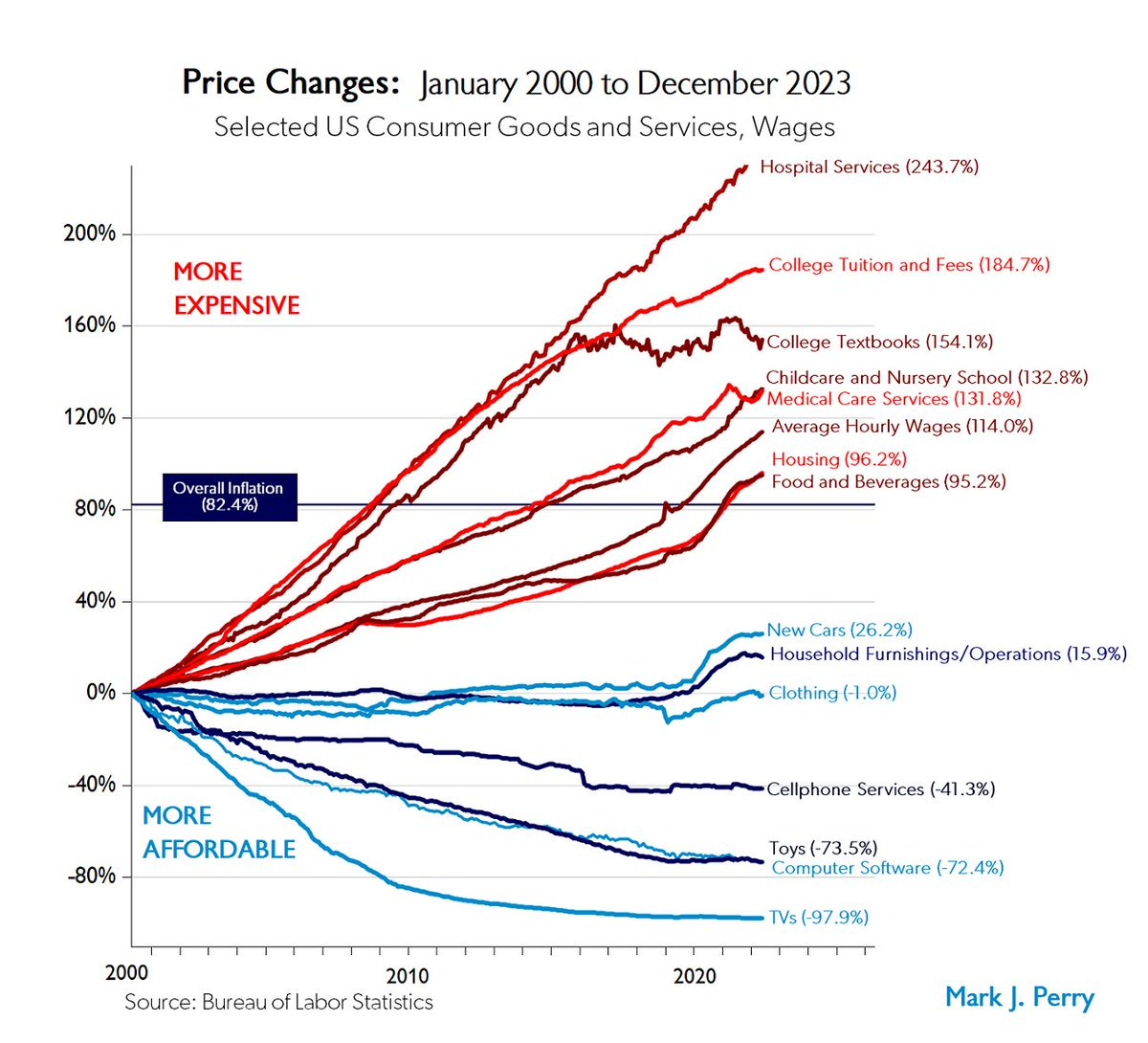
Did televisions really fall in nominal price by 98% in two decades? Or were the quality adjustments being applied that suffer from the lower bound problem?
Think about it. If a television cost, say, $100 in 2000, then according to this price index, that television should cost $2 today!
What about my television?
I’m not too worried about quality adjustments in the CPI right now. Computers are quality-adjusted but are a tiny fraction of the consumer spending basket. Only 1.3% of spending is on all personal computers and audio-visual equipment.
I think it is important to understand the many choices that come with creating a price index and how each choice leads to another caveat on its interpretation.
What about my television?
The ABS reckons computers and audio-visual equipment have fallen in price by about 74% since 2008 (Table 9, Sheet Data6, Column BU from here). That would imply that a similar television for me today would cost about $117.
A somewhat equivalent model, though probably still better than by previous one, can be bought now for $200, or a 54% nominal price decline.
Depending on your approach, we learn that television inflation was either zero, as per my average market purchase, or -56% based on observable prices of similar models, or -74% with quality adjustment and bundled in with computers.
Advertisement – Fat Tail Investment Research
Fat Tail Investment Research is an Aussie outfit that publishes research on a range of investment options. The people there have been readers of my work for many years.
Sign up for free using this link for their investment insights about stocks that historically pay a consistent income AND could deliver capital growth.

Nice post, but was disappointed when I realised your table wasn't about actual Kangaroos and Koalas.
The problem with the chart is if you adjust for quality, value for money in health care delivery has improved.
People are more overweight, less active and still live longer (in Australia). Some of this is less smoking. But some of it is better quality health care.
The options for diabetics, with metformin, ozempic etc. are game changing.