Housing stock per capita mostly measures demographics
I don’t like this chart.
Not only is there an unjustified implication of direct causality (X causes Y, and planning regulations cause X), the pattern in the chart rests on choices about
I want to focus here on how comparing countries with different demographic trends, particularly ageing, has implications for interpreting housing stock per person measures.
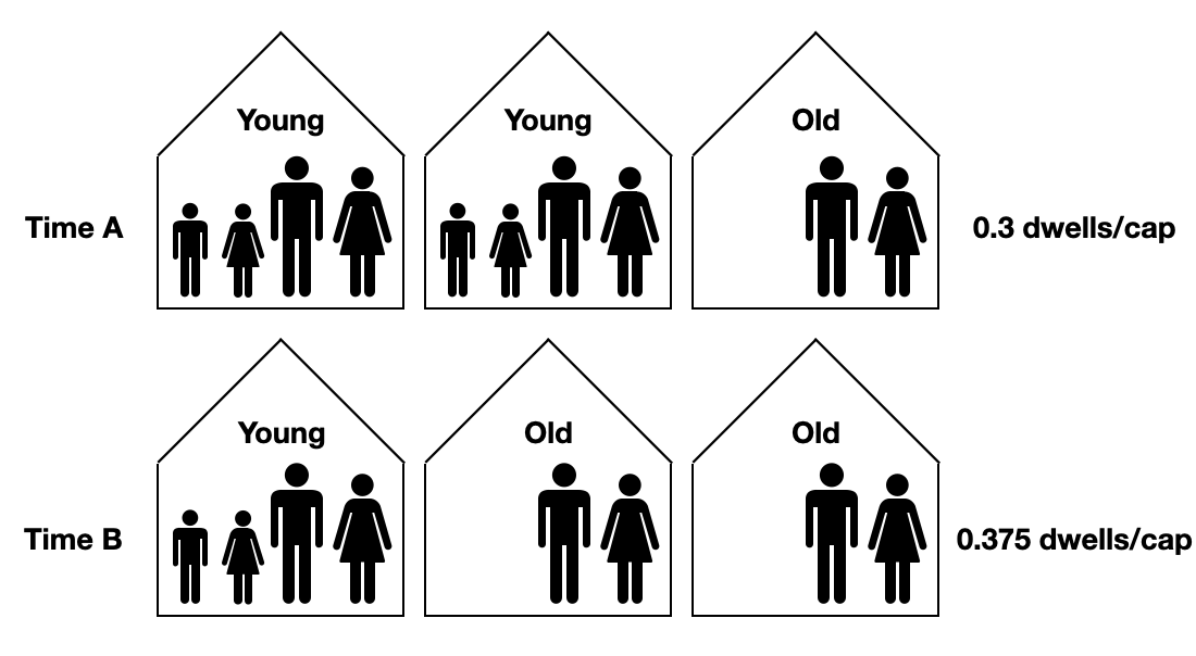
The diagram below helps show how an ageing population will automatically generate high measures of housing stock per capita growth.
At Time A the population distribution is eight “young” for every two “old”. “Young” households typically have four persons per dwelling and the “old” have two.
At Time B, the population distribution has aged so that young and old each make up half the population.
The number of dwellings per capita rises from 0.3 to 0.375 between Time A and Time B. This is a massive 25% relative increase in the dwelling stock per capita measurement, similar to what was seen in Japan from 1990 to 2015.
However, this is a product only of the changing age distribution. At each time, each young household has exactly the number of dwellings they want. New housing construction exactly matches the new demographic demand for new households. The outcome is merely an artefact of the way that fewer young households are forming for every old household being formed.
This is exactly what is happening in many European countries in that first chart that I don’t like. In Japan, aged single and couple households have been the fastest growing household type for decades.
I welcome a conversation about demographics and the housing market. But it doesn’t make sense to use a metrics that mostly captures demographic trends to imply something about regulation and housing construction.
For example, the 2008 - 2015 period saw enormous property market crashes in many of the countries situated on the right of the chart, with asset prices down 20-50% in real terms (Ireland, Portugal, Italy, Greece, Spain, etc). But this was not the case for most of those on the left of the chart (Australia, Sweden, Norway, Denmark, etc).
Why measure asset prices deflated by an index of consumer prices of goods and services? The sale price of a residential property asset is not a measure of the economic price of housing (i.e. the price of occupying housing relative to the price of other goods and services). It is like measuring the price of a computer by looking at the CPI-deflated price of Apple stocks. Read more about how to understand the price of housing here.


Nice, clear short note. Cameron you could (should?) write a whole article about how thing X which is purportedly about Y is really about demographics. In the US, I found that declining mobility rates (ie, more people staying in their homes for more than 10 years) is happening across age groups, but the trend in the aggregate is strongly driven simply by people getting older (old people tend to move less frequently).
There's so many moving pieces in household formation. This explanation is good but I'd love to see if the age kids move out of home matters. That's changed dramatically. As has the age people have kids. In time B, the people with kids might be as old as the empty nesters in time A.
Housing stock matters too. e.g. Back in the day, young people moved into share houses. Four 20-year olds in a big rambling house in the inner city. Now that house has caught a $900k reno, been profiled in Vogue Living, and a barrister lives there with her Professor husband amid the pashmina throws and the original artworks. Their kids, if they've moved out, now live in apartments. And not with 3 housemates. So there's more dwellings per capita, but each with less capacity.
I feel like these pieces push and pull in different directions.