
Why do these housing charts look like a banana?
How economics makes sense of the banana-shaped patterns in our world

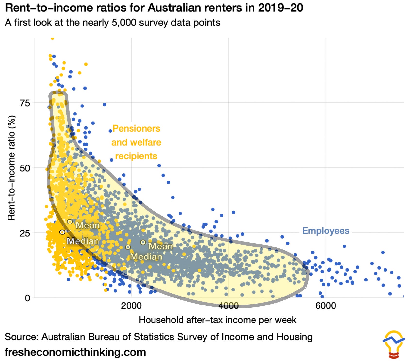
Here is a housing chart that looks like a banana.
In this post, I will show you some more banana charts and explain the economic reasons why such patterns are common but often misinterpreted.
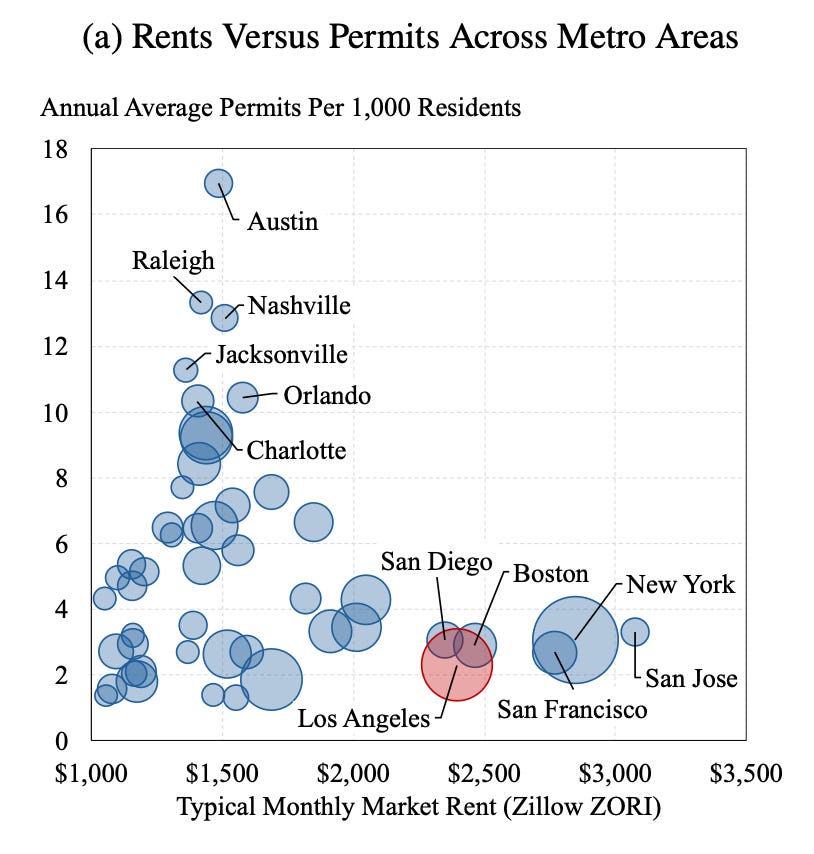
Here’s another banana chart that was recently popular in housing circles. It was interpreted to mean that faster housing permit rates cause lower monthly rents.
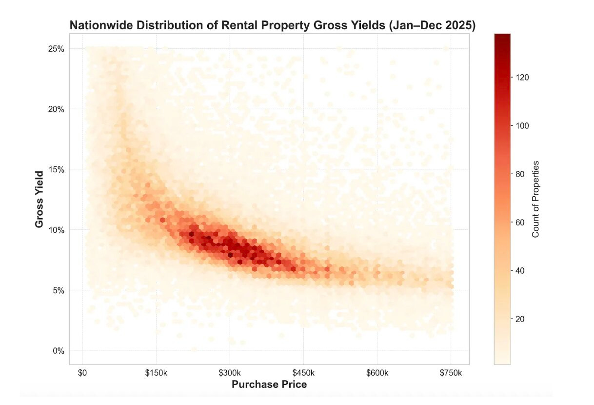
Here’s one plotting the gross yield and purchase price of rental properties. This was interpreted to be the result of a trade-off between risk and return, notably of the lower long-term returns due to the poor condition of the housing amongst low-price, high-yield homes.
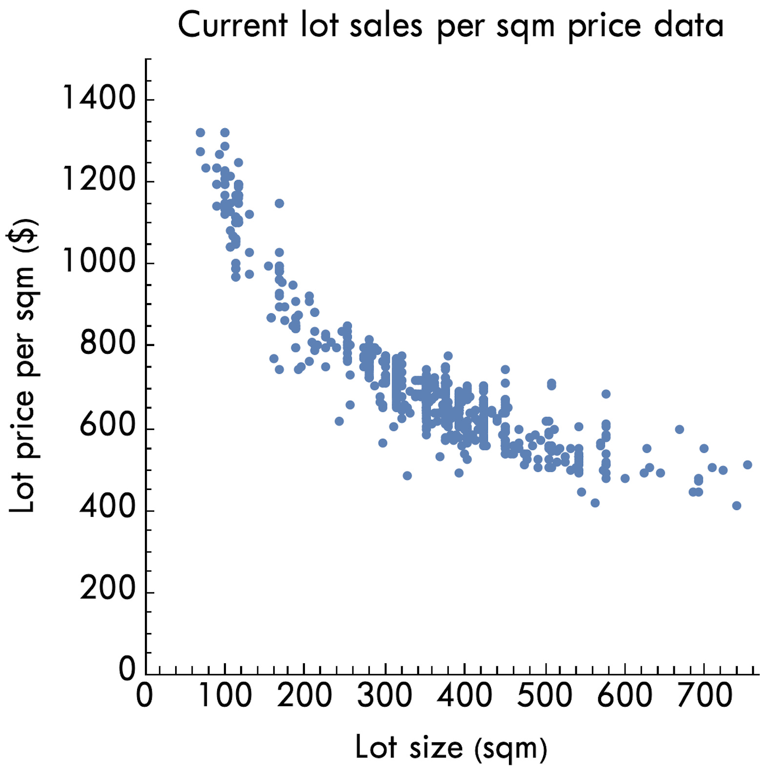
Here’s one with a rotated banana plotting lot land size (x-axis) and per square metre price (y-axis) in a major new subdivision. This banana shape has been interpreted by the popular analytical method of Ed Glaeser to be the result of planning regulations. He thinks that in the absence of zoning regulations, we would see a straight horizontal line.
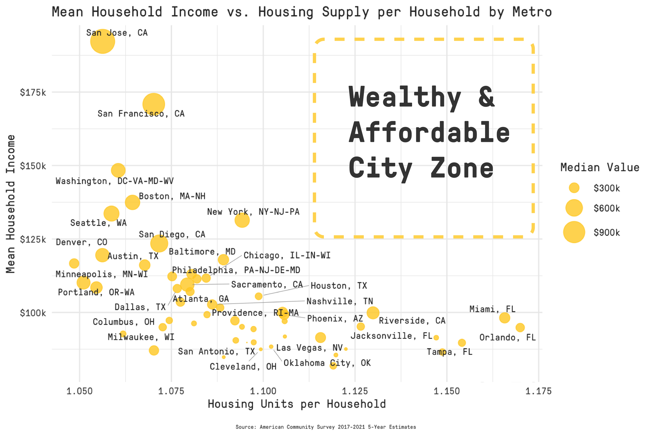
Here’s another. The author interpreted it this way: “There’s no reason we can’t have wealthy and affordable cities. We just have to increase the denominator of aggregate income per household.” Regulations are implied to be the cause of the lack of data in the top-right corner of the chart.
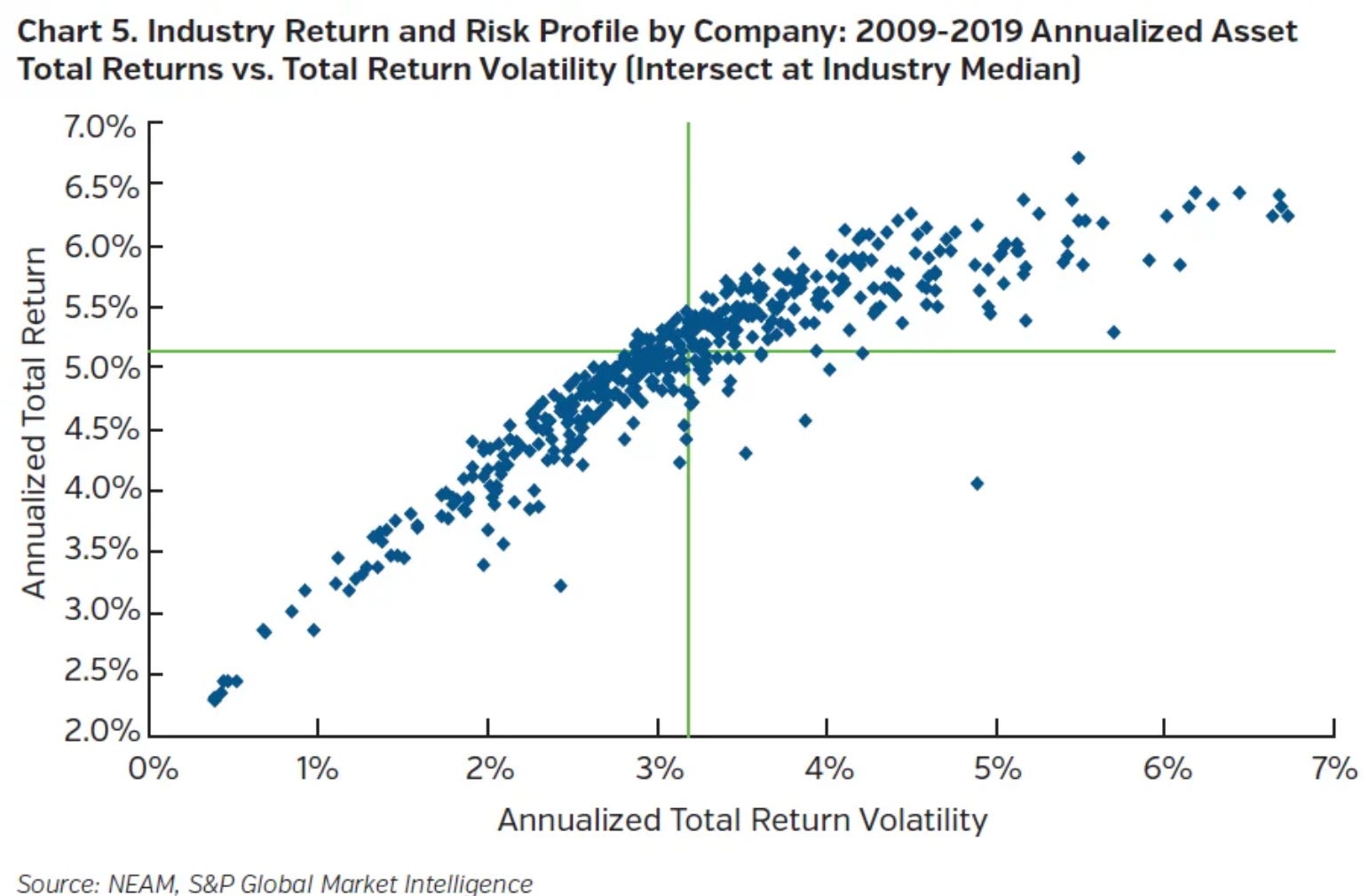
Finally, here’s a banana chart that emerges when you plot financial returns and volatility (risk). It’s not housing, but it shows a similar pattern, with a rotated banana. The interpretation of this relationship is simple—markets price in risk.
Each banana chart usually has an ad hoc interpretation. You will notice many more charts and many more ad hoc interpretations as you dig deeper into housing or any other market.

Don’t forget about the upcoming Land & Housing Economics Workshop I am hosting in Brisbane in June. Tickets are here, and the event flyer with full details is below.
Also, check out this recent conversation I had with Tim Williams on the Gimme Shelter podcast.
Is there an economic reason for these charts?
The reason for these banana-shaped relationships is simple but subtle.
Markets price in all trade-offs.
What does this mean?
Read on and subscribe to find out (you can also unlock this article with a free trial)
