


A new paper by Schuyler Louie, John Mondragon, Rami Najjar, and Johannes Wieland (LMNW for short) makes a point I have made many times before—housing is not a one-dimensional product where extra demand translates into extra quantity of homogeneous units of things called dwellings.
Or, as they describe:
The standard housing framework in this literature has a single margin of adjustment: all changes to housing demand and supply operate through a single price and quantity of housing, with quantity typically (although not exclusively) measured as units or floor space.
This matters.
Too often, analysts compare the change in the number of homes in a region with the change in its rent or price, and infer that they have learnt something about housing production (supply) and the effect of planning regulations.
But LMNW make clear that this approach tells us nothing at all about supply conditions.
They explain it like this:
We trace out the implications of introducing three realistic features of housing markets: first, some households are rich and some are poor; second, rich households purchase higher-quality housing than poor households; third, high-quality housing is harder to produce, and so more expensive, than low-quality housing. In this setting, there are many unit-supply functions, each indexed by unit “quality”, where quality reflects both physical margins (size, finishes, and so on) and location-specific amenity quality. Thus, the standard single-margin supply and demand functions that relate changes in prices to changes in the number of units alone are misspecified as prices also encode information about the supply and demand of unit quality.
That is a bit much jargon for me.
So let’s look at the scenarios LMNW use to illustrate the point — a lottery and an influx of poor migrants to a region. These scenarios reveal how a lot of what is blamed on regulation and supply-side issues can emerge for sensible demand-side reasons, which also explain many of the patterns we see in housing markets that get ignored in most economic analysis (e.g. gentrification).
Let’s dig in.
Lottery scenario
Here’s their first scenario.
Consider a situation where all households win the lottery. We have assumed that there is no migration, so all this additional income will be spent on more housing quality and non-housing consumption in the city. Quality demanded will go up, which means the price p(q) will increase. There is no change in the number of households or housing units by assumption.
The reason that no extra homes are produced in this lottery scenario is that all the extra income households get goes to demand for the quality of housing units, not the demand for the quantity of them.
Everyone already lives in the number of homes they want to live in. Every household has the number of people they want in it regardless of how rich they get—so they spend more on improving housing quality, and on non-housing consumption goods, not more housing units. This is true even if more housing units of the same quality can be infinitely supplied at the same price (i.e. supply of housing units is perfectly elastic).
LMNW illustrate this lottery scenario as the red line in the figure below, which plots home prices or rents on the vertical axis (in log form) and the number of housing units on the horizontal axis (in log form). Note that the dashed blue line is for the next scenario.
I had put the paywall here, but decided it was more important that these ideas were widely read. If you get value from the rest of this article, please consider becoming a paid subscriber.

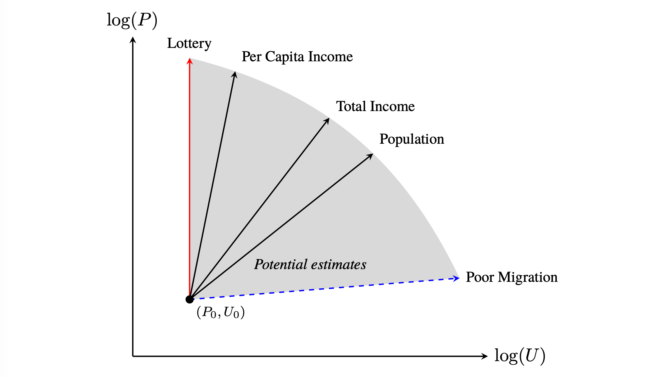
In this scenario, more housing is supplied in the form of quality, either in the size and design of the buildings themselves, or in the form of the relative value of the location (a location quality benefit).
I try to visualise how this confusion between more housing supply on the quality dimension and lack of supply on the quantity of housing units dimension arises in the diagram below.
The top row shows the baseline pre-lottery market equilibrium of quantity and quality.
The second row shows an increase in demand for quality only. Homes get better, but if you are looking only at the quantity of housing units (the final column, blue charts), you will observe the price increase due to more supply of quality per unit, but no increase in the quantity of housing units. You might inadvertently infer that supply is inelastic because prices went up but the quantity of housing units didn’t. But this is a result only of the fact that demand increased in the quality but not quantity dimension.
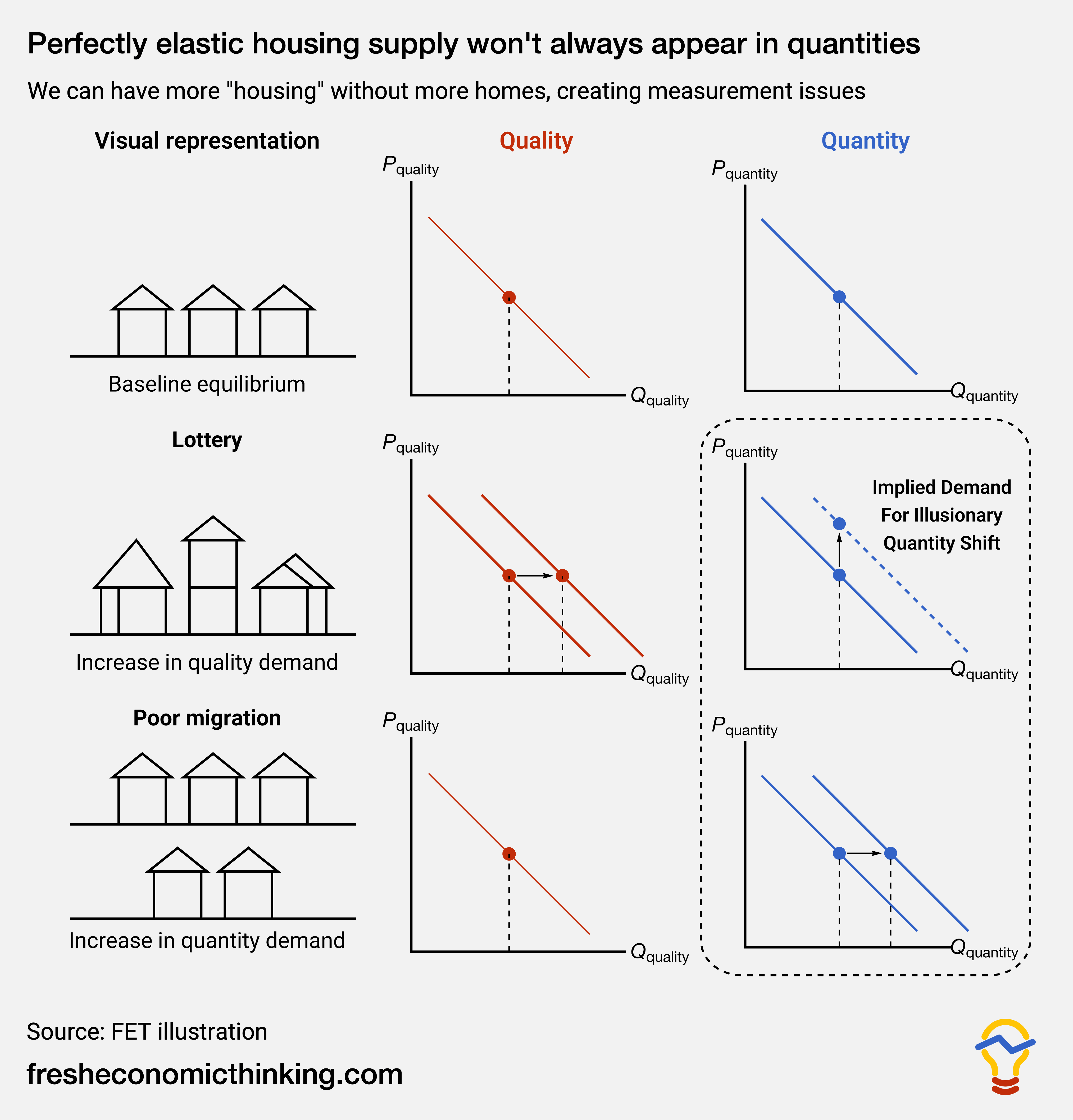
If you correctly look at the quality dimension (or the quantity of quality attributes), then you will see that housing quality is supplied perfectly elastically (the second column, second row, red chart).
Or, in their words
From the view of the single-margin model, these data incorrectly imply a perfectly inelastic supply curve, but in truth there has simply been no change in the demand for units at the same time that quality demand has increased.
This distinction really matters. As we get richer, we of course want to buy more housing. But housing is a whole category of expenditure, not a single uniform product.
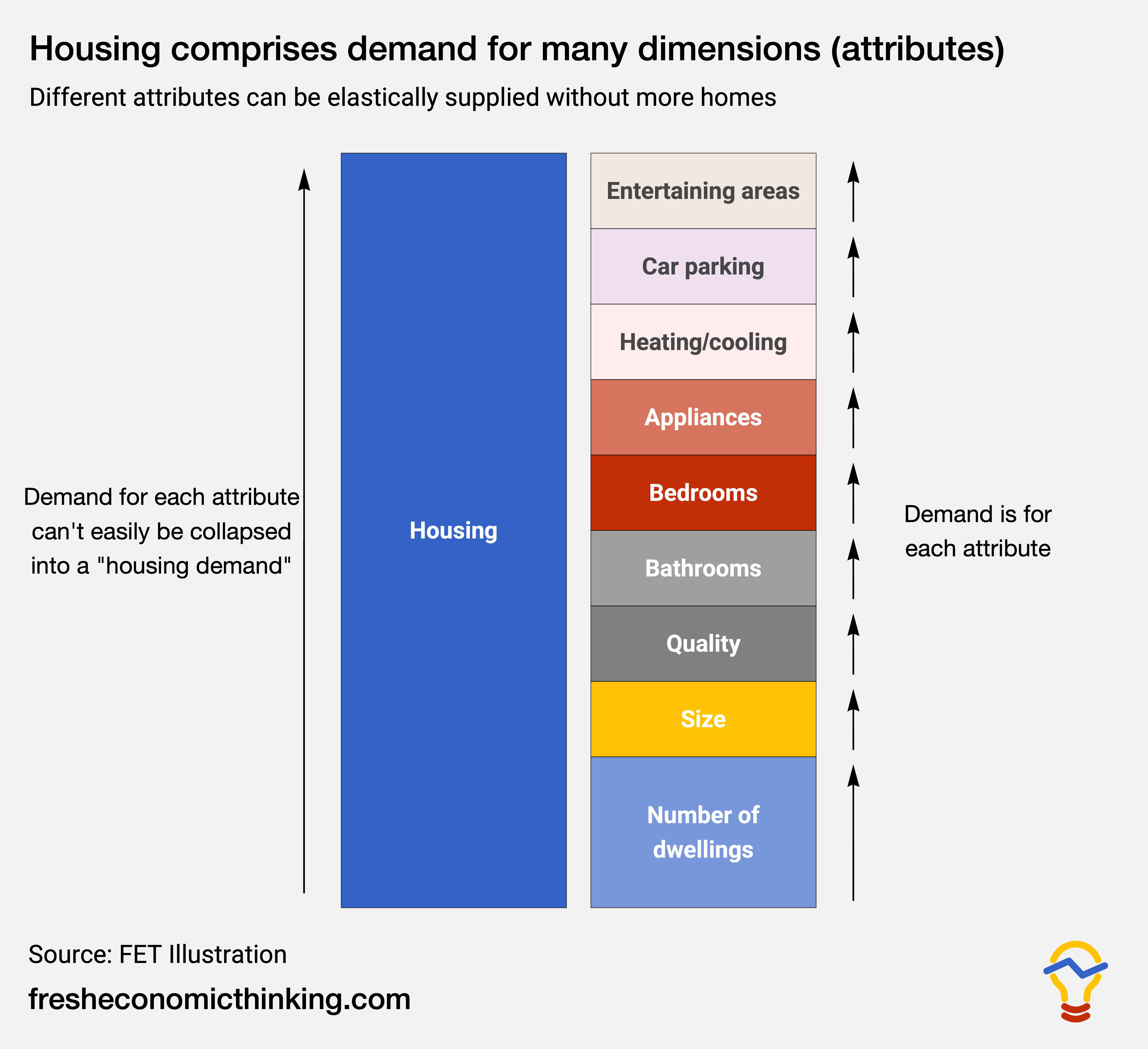
The illustration below shows how housing is a category made up of a variety of different attributes that we value. Total market demand for housing as a category is merely the sum of demand for all the attributes. As LMNW’s lottery example shows, sometimes demand will increase for many of the attributes of housing that are not related to the quantity of housing units.
Poor migrant scenario
LMNW’s second scenario is an influx of poor migrants to a region.
They plot this scenario as the nearly horizontal dashed blue line in their above chart. All quantity demand, no quality demand. I plot it in the above FET chart in the bottom row as a pure quantity demand shock.
The reason that new migrants must be relatively poor in this scenario is to ensure that any change in quality demand from their migration choice is negligible.
What this scenario shows is that for us to observe perfectly elastic housing unit supply when it exists, demand must shift only for more housing units and not more housing quality at all. This is likely to be an uncommon scenario in reality.
Spillover scenarios
What LMNW then look at is an even more subtle point — that migration into and out of a region is itself determined by the incomes on offer and the rents or prices of homes, such that migration happens when total quality of life improves (a concept known as spatial equilibrium, which is briefly explained in this FET article).
Changes to the income distribution change migration choices. That’s how we get things like gentrification, where high-income people move into a region, and this change leads to low-income people leaving. The basic lottery and poor migration scenarios did not allow any such feedback, or spillovers, to migration choices.
LMNW expand their lottery experiment in three ways to allow it to affect the wealth and income distribution and therefore lead to spillovers in terms of migration choices.
The first way is this.
Reconsider our lottery experiment, but now assume that only rich households are eligible to win. This prospect draws in rich households, driving up house prices. Higher prices reduce real incomes for poor households, who migrate out of the city. It can easily be the case that the outflow of poor households is larger than the inflow of rich households so that prices increase but population and units actually decline.
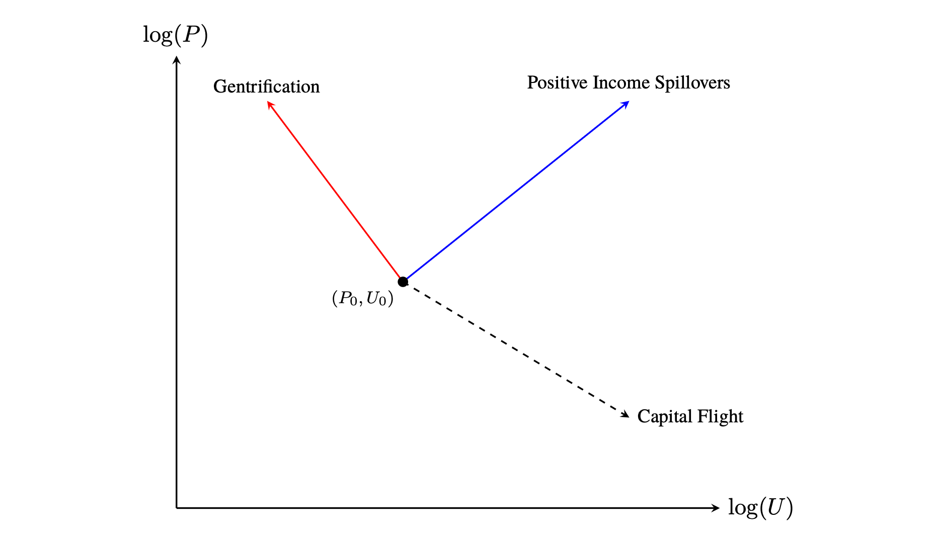
They show this in the red Gentrification line in the chart below, which reflects an increase in price and a decline in the quantity of housing units in a region. In this scenario, the Gentrification outcome is due to a positive demand shock (a rightward shift of demand) to the upper portion of the income distribution. But because of spillovers to the migration decisions of others lower down the income/wealth distribution, who migrate away, a very unexpected relationship between the price and quantity of housing units emerges, even though housing units are perfectly elastically supplied.
This process of gentrification, whereby fewer larger, higher-quality homes emerge in areas where demand for housing has increased, has been an observable part of the recent housing boom in Australia.
In high-value Sydney suburbs, cheaper housing units are being replaced by fewer, larger, higher-quality ones, forcing out low-income households as a response to relatively higher demand for quality than quantity.
The quote below from a 2023 news report illustrates this exact dynamic.
Two examples of potential net dwelling loss in the Sydney council area include a development application (DA) by property developer Fortis to knock down a 1970s residential complex with 28 apartments in Elizabeth Bay and replace it with only 22 apartments. Another developer plans to demolish 20 dwellings in Potts Point for a new block housing five apartments.
However, Fortis has defended its Elizabeth Bay DA, with associate director Patrick Baldock saying the proposal would increase accommodation on the site by providing 64 bedrooms plus studies compared to the current building’s 48 bedrooms.
The second way LMNW expand their lottery scenario to incorporate spillovers is this.
Alternatively, if rich households consume services provided by poor households so that poor incomes are increasing in rich incomes, then the gains from the lottery will be shared and can cause in-migration for both types of households.
This is labelled as Positive Income Spillovers in their chart. You might think of this scenario as capturing the normal dynamics of a regional economic boom. Think of the Gold Coast since the COVID lockdowns.
Finally, the third way LMNW look at how changes to the income and wealth distribution can result in spillovers is this.
Now imagine that only poor households are eligible for the lottery, that rich households prefer living with other rich households and that poor households are indifferent. Higher incomes draw in poorer households, but this causes out-migration from richer households. If inequality is high and the rich really dislike living with the poor, then house prices may actually fall at the same time that there is an increase in housing units.
This is labelled Capital Flight in their chart. Another way this scenario might be described is as a negative amenity effect — there are many extra homes, but the area has become relatively less desirable because of the changes associated with those extra homes. More homes in a region, but lower rents and prices.
Time also matters
LMNW show that the shape of housing demand and the spillovers it generates lead to an enormous variety of relationships between housing quantity and price. In addition, the choice of time frame over which price and quantity observations are made matters, too.
Housing markets move slowly. A home bought off-the-plan today because of today’s market conditions might get built and available to occupy in 3 or 4 years.
Recent analysis by e61, for example, found that the peak of housing pre-sales for apartments in the 2010s Sydney boom was in 2014, but the peak of construction completion of those dwellings was in 2018. The chart below is from that e61 analysis and shows how the pre-sales peak coincides with price growth, and hence rising demand, but the actual completion of those dwellings coincides with a price downturn.
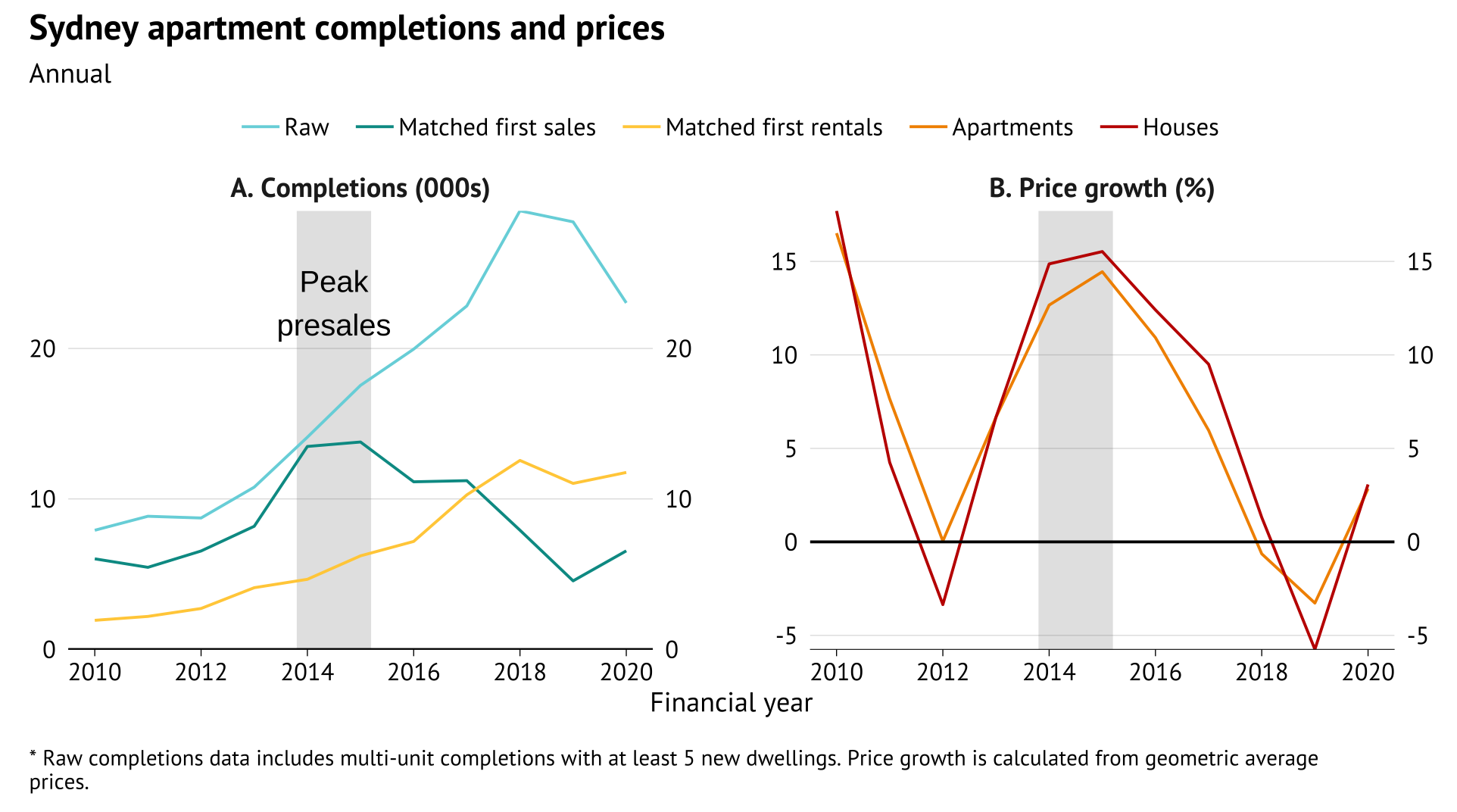
Whenever you look at the relationship between change in price and change in the stock of homes or rate of new housing produced, you must do so over a certain time period—maybe over a year, maybe over a few years or a decade. And each choice of time involves selecting one part of a slow-moving market cycle.
Aziz Sunderji has shown, in the chart below, how the correlation between new housing permits and price growth is not fixed over time and varies across the market cycle, inverting during downturns. If you observe quantity and price during a boom, it slopes up (like the Positive Income Spillovers line of LMNW). If you observe during a bust, it slopes down (like the Capital Flight line of LMNW).
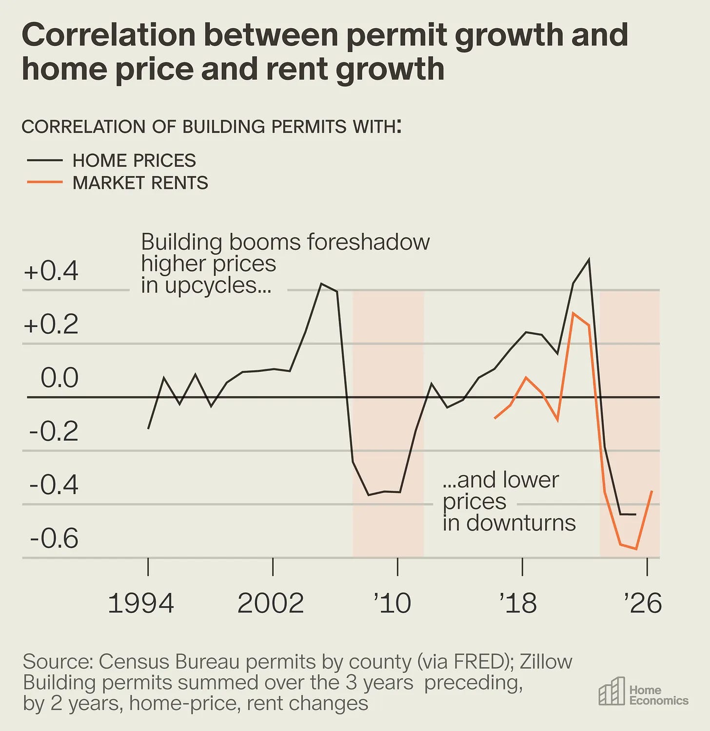
This doesn’t imply that regulation or supply conditions have changed. Downturns are not supply shocks, but changes to demand. This is essentially the same point made by LMNW— the shape of demand, in this case over time, will affect the observed relationship between price and quantity.
So what?
The lesson from LMNW’s paper is this.
Even without any regulatory constraint on the rate of housing production, its density, quality or any other attribute, when you look at housing unit price or rent and quantity changes in a region, the relationship can be just about any shape for normal demand-side reasons.
What looks like inelastic supply in a region might simply reflect that there is relatively higher demand for quality than quantity, for example.
Or, in their own words.
How can exogenous increases in “demand” for certain types of housing sometimes lead to increases in prices and declines in units and other times lead to increases in units and declines in prices? These seemingly perverse outcomes arise naturally from the facts that demand is not monolithic and that poor and rich households are connected to each other through local housing and labor markets.
The PDF below is their full working paper.

Put Fresh Economic Thinking to Work
Why a paid subscription matters
A paid subscriber to FET wants intellectual challenge. They don’t want someone to write what they already think. They want insights that are hard to get elsewhere and a public debate that is intellectually honest, not tribal.
Subscribing is a vote for independence — you're saying I want Cameron Murray to have the financial freedom to investigate things that other economists won’t.
If that sounds like you, and you get value from the research and analysis published here, I’d appreciate your financial support.
A fresh economic consultancy
Most economic consultancies begin with the conclusion a client wants. They sell institutional credibility and a report. I sell economic thinking.
If your organisation has a difficult economic question, a policy argument that needs testing, or a problem where you want to get beyond the usual consultant consensus, I’d like to hear from you.
FET also provides custom economics training, presentations and workshops for organisations that want their people to understand the economics behind the issues they work on.
If there are economic concepts, debates, or blind spots your team needs a genuine handle on, then please reach out.
Ground Rules: Land and Housing Economics for Professionals
Put that professional development budget to work with an upcoming FET Land and Housing Economics workshop in Sydney or Melbourne in Nov 2026.
This two-day workshop is crafted for smart researchers, policy analysts, economists and planners who want to truly understand how land and housing markets work, and the limits of our policy interventions.
Sydney tickets here.
Melbourne tickets here

More details here.

As always, please like, share, comment, and subscribe. Thanks for your support. You can find Fresh Economic Thinking on YouTube, Spotify, and Apple Podcasts.