
Charts that lie go viral
Hone your senses to sniff out bad charts

A lie can travel halfway around the world before the truth can get its boots on
—according to various misattributed authors
My gut instinct when seeing a chart online that supports my view is to feel smug. I feel proud. Validated. I want to share it immediately.
But.
This instinct is also why so many lies and deceptions go viral. No side of politics is immune to this. It’s human nature.
I want to help retrain our collective instincts in this article.
If we want to build up a sensible understanding of the world, particularly the relative magnitudes of economic and social phenomena, then we need to train ourselves to pause and conduct a sniff test when we feel that validation of our concerns in chart form.
Here I want to share some charts that you might have seen recently and explain how I was able to quickly sniff out problems with them.
One trick is to assume that the people who produce charts simply don’t know what the data means.
This is common.
I remember trawling through data looking for patterns that seemed at first glance to support my views based on the naming conventions used. But over time, you learn that naming conventions can badly mislead and that, like a much younger version of myself, most people don’t fully understand the data they are plotting.
Let’s get to those examples.
Sexless young men
Here’s one about the rise of sexless young men. Always good to combine a lying chart with sex to get you a million views on X. A label from THE WASHINGTON POST adds credibility. But when a chart shows something terrible about Kids These Days!, you should be sniffing very hard for something dodgy.
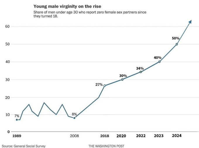
First, the data is just wrong. It’s made up to sensationalise. More of a “if these trends continue” projection with a nice arrow to boot. Here’s the actual survey data.
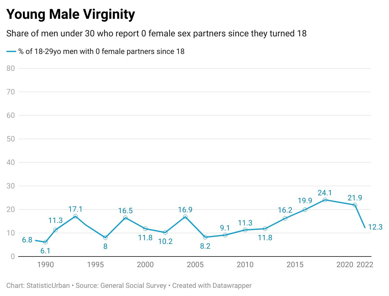
What you see is a lot of variation between survey years. If we were back in 1993, we would be alarmed at the rise from 6.1% to 17.1%, a near tripling! But this isn’t true—it’s just variation due to small samples of men in that age group in each year’s survey.
The General Social Survey (GSS) has a total sample of around 3000 people, and response rates have declined from a fairly consistent 75-80% since 2014 onwards, dropping to 44% in 2024. So there is more self-selection in the sample of survey respondents.
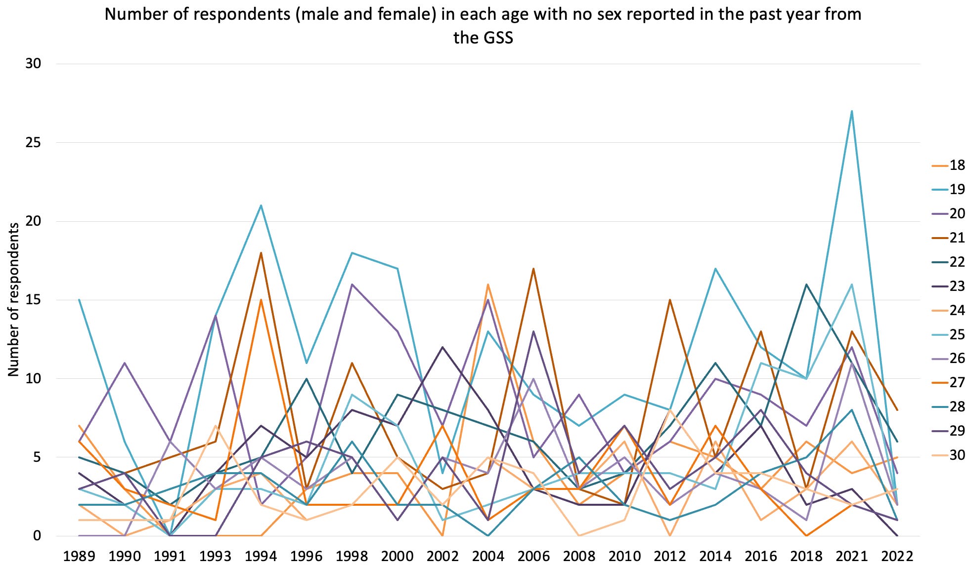
There are also fewer than 30 people of each gender in each age bracket in the survey. So when we look at the actual survey data to make claims like “men aged 18 to 30 have less sex”, we are saying “of the 350 men from last year who bothered to respond to the survey out of the 700 we approached, fewer respond to the question as had having sex”. When I tinkered with some of the data, a lot of these results were coming from a single strange age group. For example, in 2021, the number of 19-year-old respondents who did not have sex surged, but then collapsed to its lowest level ever in 2022.
Also, this is just one survey. Other surveys show the opposite pattern. I’ll let Lyman Stone explain about these issues with the apparent mid-2010s rise.
However, two other large surveys, the National Survey of Family Growth (NSFfG), and the National Health and Nutrition Examination Survey (NHANES), also ask about sexual behavior. Their results do not confirm the trends seen in the GSS. However, they also have slightly different questions and slightly different survey populations, so they may not be directly comparable. The NSFG, for example, shows a far higher rate of sexlessness to begin with.
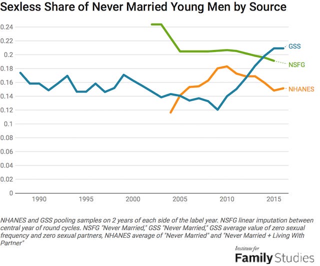
The graph above shows that while there’s some reason to think a growing share of never-married young men is going sexless based on GSS data, it could be that the sexless share among these young men is about stable, as the NHANES shows, or even falling, as the NSFG shows.
The incel account of events thus far is maybe true in the GSS, but faced strong rebuttals from the NHANES and NSFG data. Not a glowing endorsement of the incel narrative!
Australia’s bloated bureaucracy is make-believe
This chart did the rounds a few months back. Rather than Kids These Days, the Bloated Public Sector is the timeless frustration being tapped into. The chart validated a common concern.
Look at Australia. Top of the chart. Apparently, Australia has nearly 15% of the population (not workforce, population) in the public sector. This is more than twice the proportion of most other comparable nations.
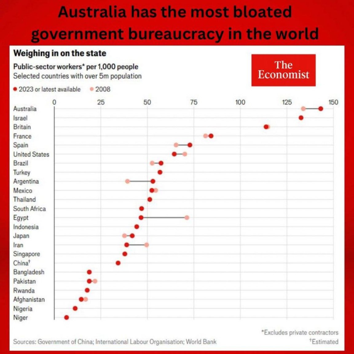
The was published by The Economist and the data is correctly sourced from the International Labour Organisation (ILO) database. The problem is that this database is not coherent or consistent.
In that particular ILO database, the Australian data comes from the HILDA survey of households, while most other nations were sourced from national statistical offices that rely on annual reports of public service agencies.
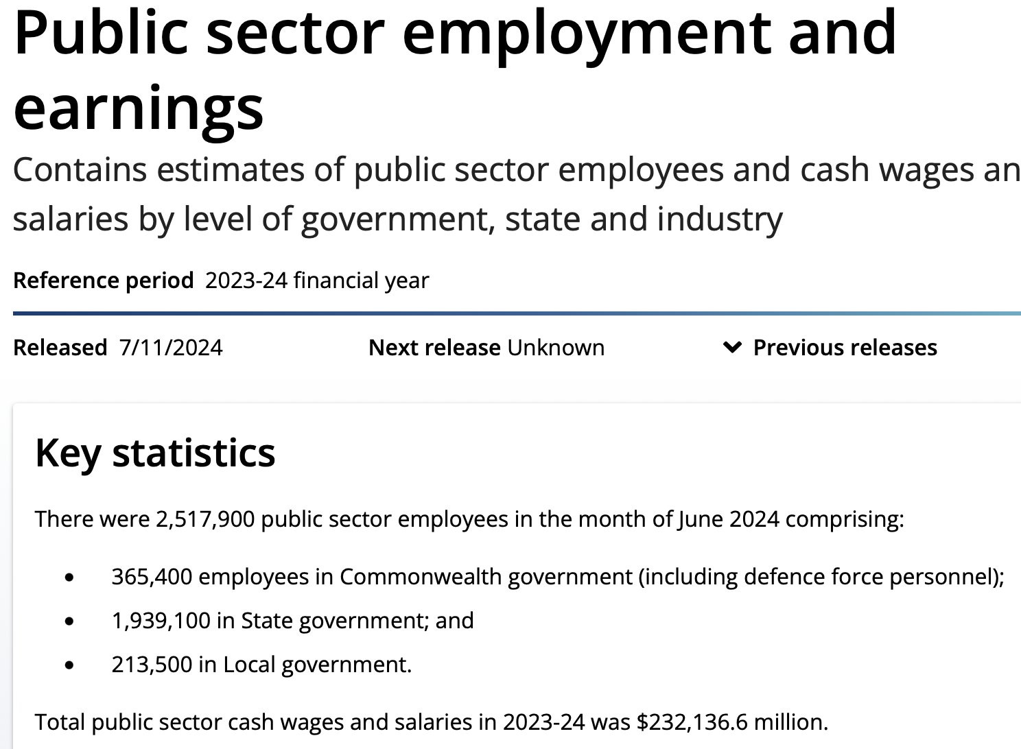
Conflicting approach in the data meant that the ILO database recorded an estimated 3.7 million public sector workers in Australia in 2021. Yet the Australian Bureau of Statistics (ABS) numbers had total public sector employment at 2.5 million in 2023.
Where did the extra 1.2 million workers come from?
I don’t know.
What I do know is that the data is problematic. The ILO data suggested that Australia had 29% of the workforce in the public sector, but a similarly wealthy nation of Austria, had only 8%. Yet the national statistical agencies of these countries put the public sector share of the workforce at 15% and 17% respectively
The data is way off.
I suspect it was just an error. The latest ILO database uses a completely different definition for public sector workers and reports Australia’s public sector workforce at 7%, the same as Austria. One error has likely been replaced with another, but I doubt a viral chart will circulate when the error makes the public sector look smaller rather than bigger.
United States healthcare
Since the United States healthcare system is perhaps an even more politically-charged topic than Australia’s public sector bureaucracy, your nose should be at the ready to sniff out possible chart deception.
I recommend following Cremieux on X to regularly get updates on bad charts, and I draw on his analysis here.
First, the bloated bureaucracy. Second, the apparent rise in maternal mortality.
Here’s a chart that would get anyone’s blood boiling.
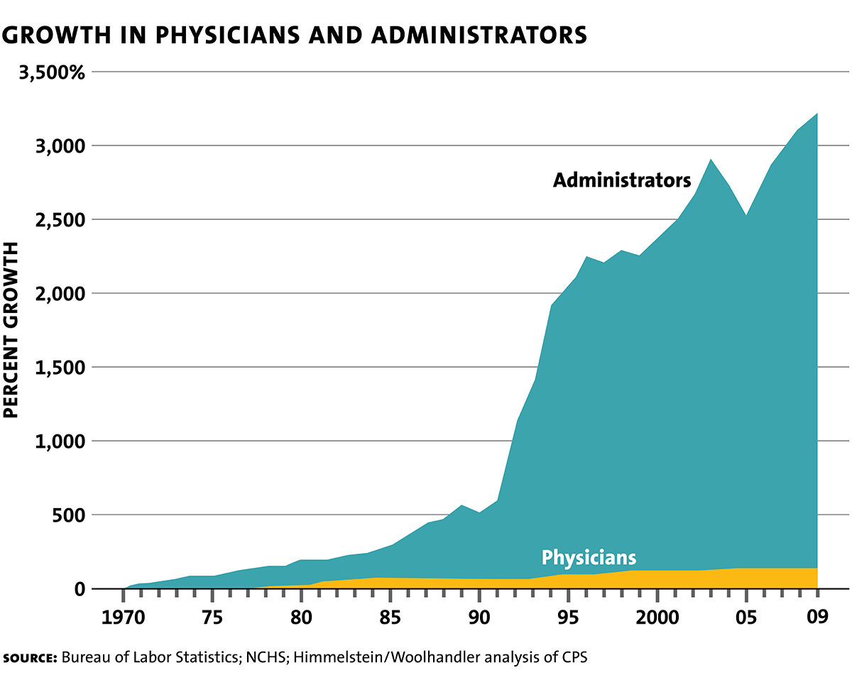
But there is no data behind it. It is possibly just made up. Kevin Drum did a deep dive into the data, couldn’t find anything comparable and concluded as follows.
Once you take into account the growth in health care generally, the share devoted to administration has gone up by 50-100 percent. That’s a lot! But it’s also not that surprising. In 1970, the health care industry spent approximately $0 on IT management. Today they spend a bundle, and all of that is admin overhead. Purchasing has exploded too, since there are far more things to purchase these days. Regulations have grown along with technology, so compliance offices have grown. Doctors and hospitals have always spent hours on the phone arguing with insurance companies, but that’s probably grown too.
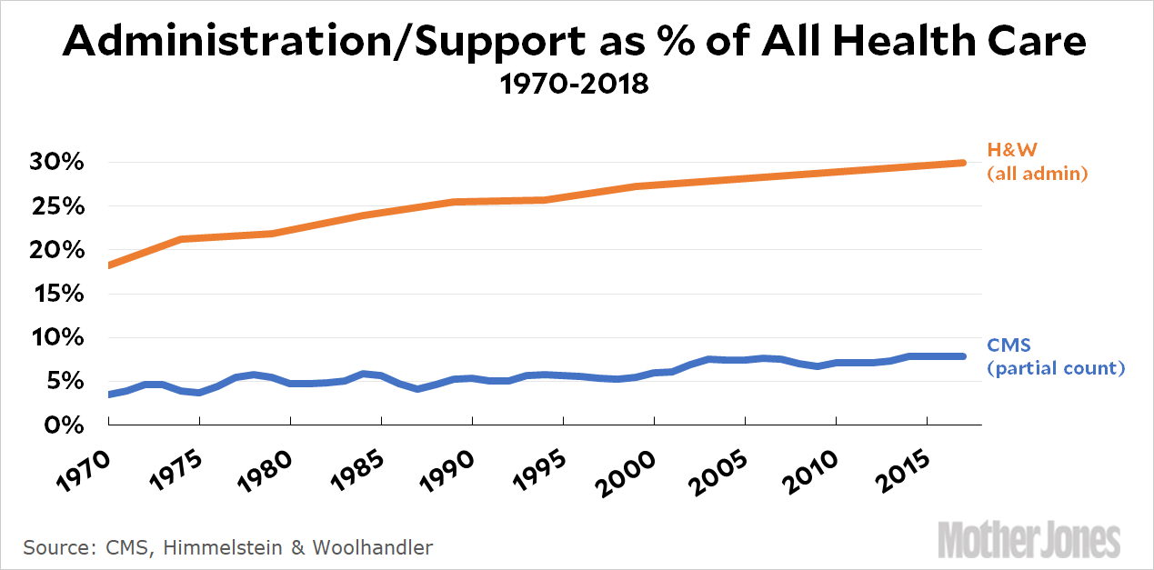
Here’s a chart showing the most likely pattern of a rising share of administration costs compared to overall costs. Like most economic trends, it shows a gradual boring change, not a sudden astronomical one.
What about the tragedy of the United States being an outlier in terms of rising maternal mortality? Seems bad, no? A chart like this shows a terrible reversal of trends that aren’t apparent elsewhere.
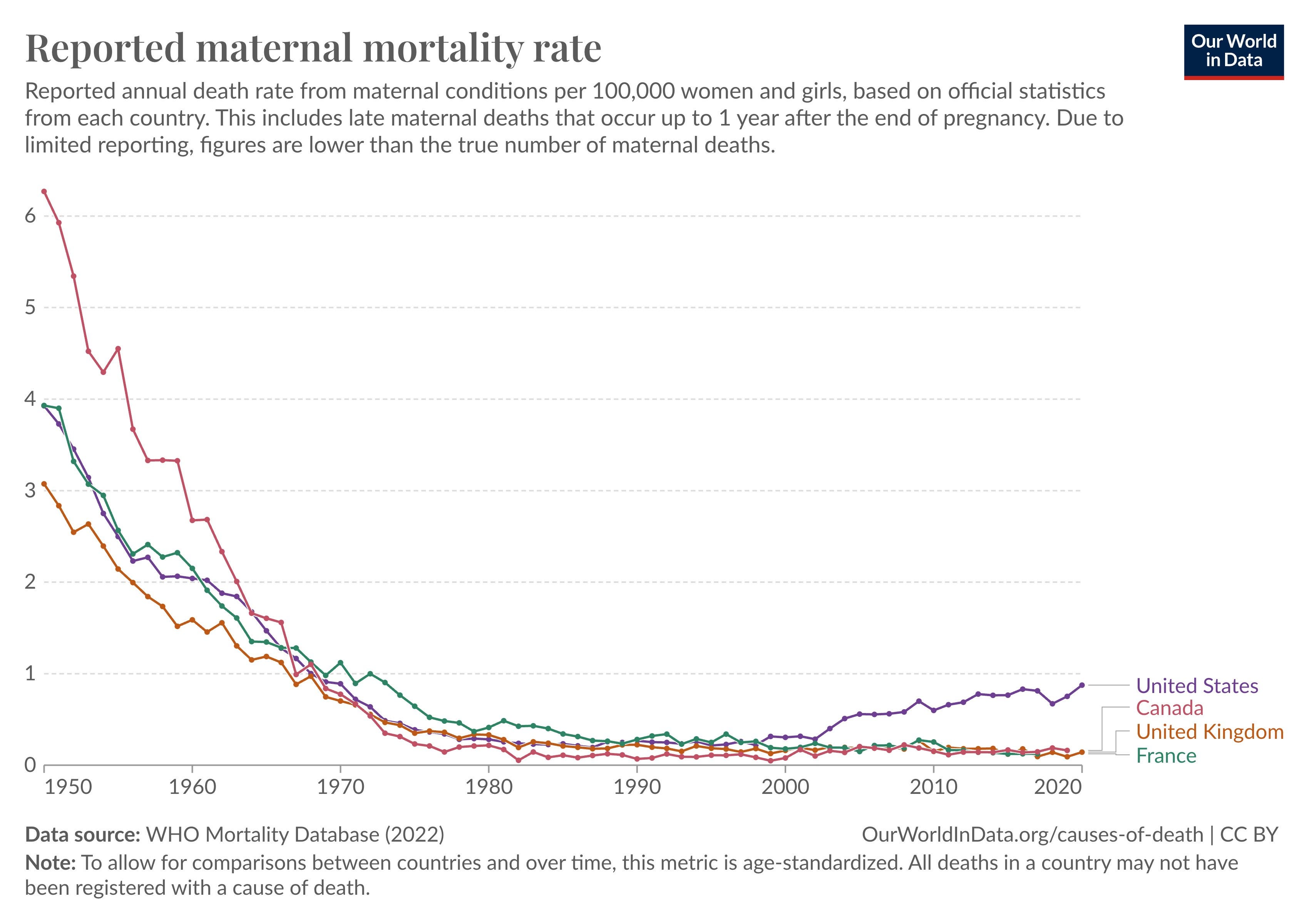
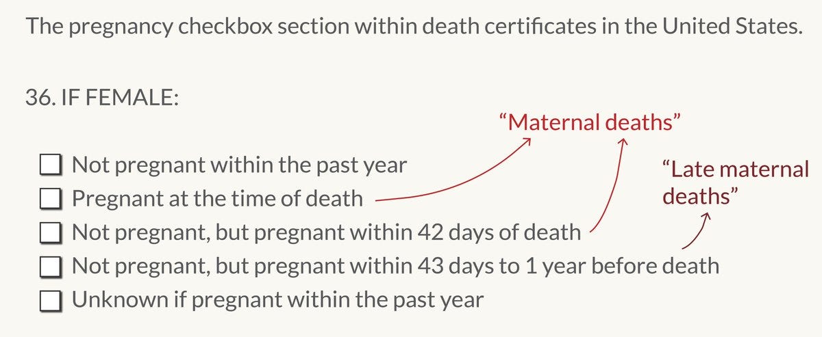
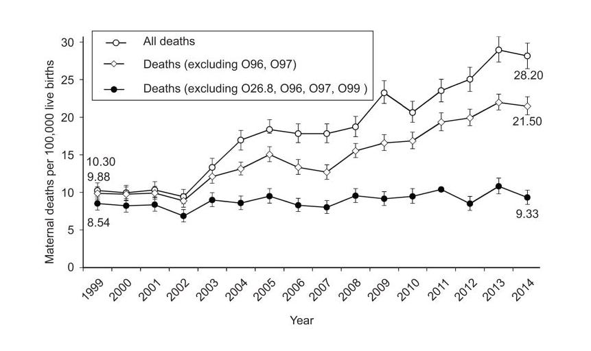
Turns out that this is a record-keeping artefact. A new checkbox was implemented for death records to stay in line with new International Classification of Diseases (ICD-10) classifications, which broadened the scope of classification for maternal deaths. Rather than deaths while pregnant or immediately post-partum, it got extended out longer and even up to a year.
As more states adopted the new checkbox for pregnancy reporting of a death, the number of deaths classified as maternal deaths.
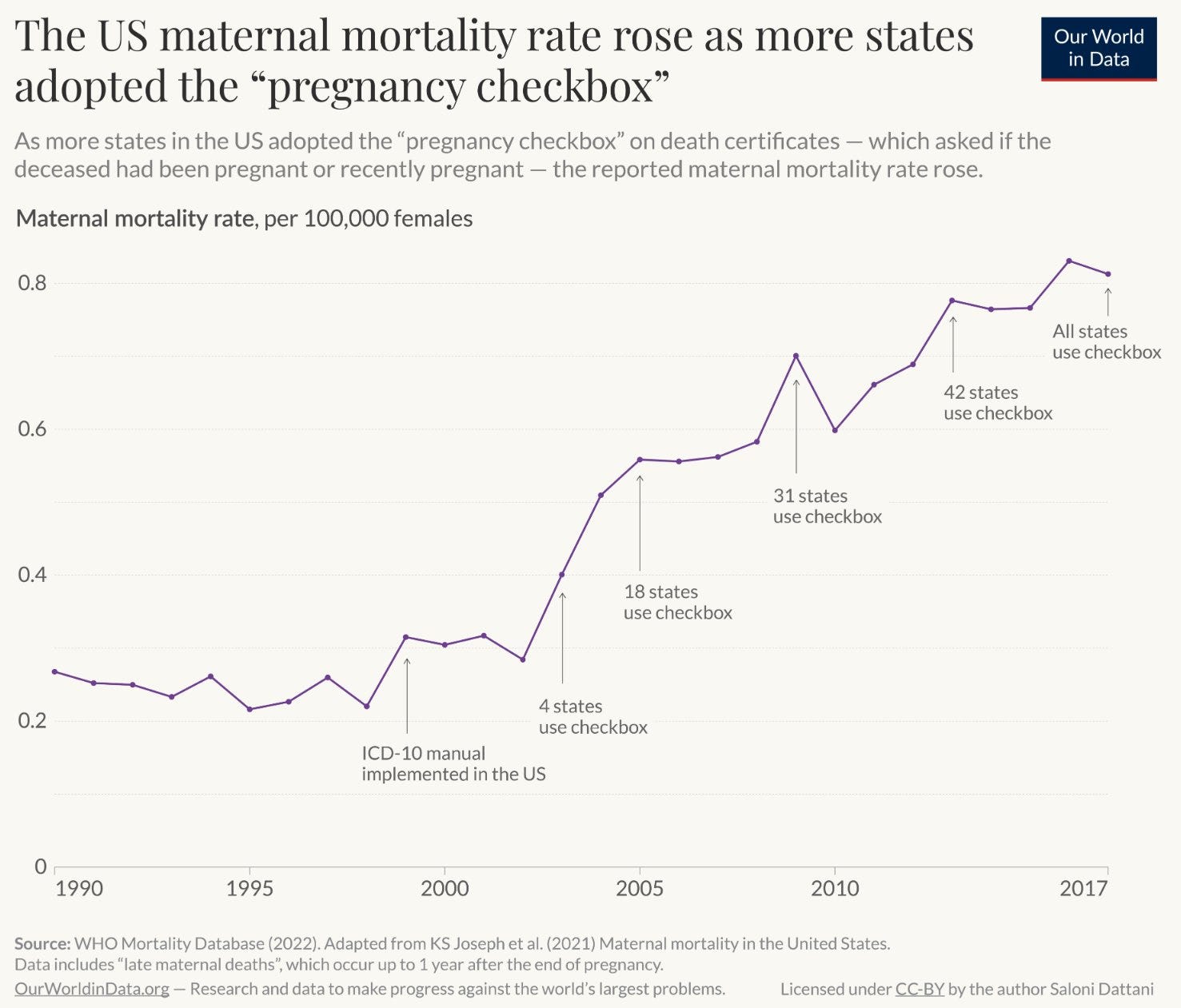
If you compare the data using previous classifications, there has been next to no increase at all.
Before you go sharing every chart that makes you feel a bit smug, maybe take the time for a sniff test. I know it’s not easy. But if we could all try a little harder, including myself, then maybe we can all get better information.
As always, please like, share, comment, and subscribe. Thanks for your support. You can find Fresh Economic Thinking on YouTube, Spotify, and Apple Podcasts.
Interested in learning more? Fresh Economic Thinking runs in-person and online workshops to help your organisation dig into the economic issues you face and learn powerful insights.
"But when a chart shows something terrible about Kids These Days!, you should be sniffing very hard for something dodgy."
Needs its own Appendix added to "How to lie with Statistics".
My favourite is the non-zero axis intercept to make small changes look critical